POPULAR READS
HERE ARE EXAMPLES OF CREATIVE CALL TO ACTIONS AND WHY THEY WORK
A call-to-action (usually abbreviated as CTA) is an image or line of text that prompts your visitors, leads, and customers to take an action. It is, quite literally, a "call" to take an "action."
However, simply putting up a button with bright colours onto your website will not do the trick. Here are some of the most common CTA buttons examples:
Design Tips
Mentioned below are crucial pointers that will ensure you reap maximum benefits of call to action buttons, hence, they must be kept in mind while developing your call to action marketing campaign:
Importance of call to action on website:
CTAs also possess an enjoyable versatility, both in regard to platform usage and actual content, that makes their usage recommended for business in all niches. Conversions, revenue, business and profit — they all depend on the mighty call to action.
Stated below are efficient call to action examples:
Call to action buttons is the closest one can get to actually walking the customer to the (digital) storefront, hence it is essential to optimize the usage of CTA buttons to stay afloat in this digital world.
However, simply putting up a button with bright colours onto your website will not do the trick. Here are some of the most common CTA buttons examples:
- Buy buttons/“Add to cart”
- Information-gathering forms
- Subscription signups
- “Read More”
- “Try it Now”
- Social media share buttons/widgets
- Help - now a friendlier “Online Chat” in many cases
Design Tips
Mentioned below are crucial pointers that will ensure you reap maximum benefits of call to action buttons, hence, they must be kept in mind while developing your call to action marketing campaign:
-
Eye-Catching Design:
For someone to click on your CTA, they have to first notice its existence. This is pretty much the one time you can veer off course from your branding guidelines: Your CTAs’ colours should contrast with your website design, yet also appear large enough to be noticed (we’ve seen them perform best around 225px wide and 45px high).
- White space around buttons
They make your button stand out - Large legible type
Ensure that your users do not need to strain their eyes to - Subtle textures
Use subtle textures that create light contrast gently guiding user’s eyes through the page. - Flat, monochromatic, small icons
Use flat, monochromatic, small icons for common actions. The users have gotten used to seeing them that way, so give them what they expect. - Bright colors
They are great tools to catch a user’s attention and invite you to click. - Friendly, conversational language
A phrase like “join us today” is friendly while making them feel like they are becoming part of a club. - Minimalism
Focus visitors’ attention on the important elements - Fun Playful Elements
Funny, playful, cheerful or delightful elements raise customers’ spirit as well as their interest.
For Example:
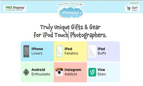
- Long shadows
An icon style that is very popular right now, as it pops icons off the page.
For Example:

- White space around buttons
- A Clear Value Proposition:
People should know exactly what will happen when they click on a CTA. Make sure the CTA explicitly tells them what they’re getting in exchange for their click - Create urgency:
Creating the feel of a buying craze with the help of different cunning text messages like: “only 1 item left” or “today only 50% discount”, is a powerful stimulus.
Importance of call to action on website:
CTAs also possess an enjoyable versatility, both in regard to platform usage and actual content, that makes their usage recommended for business in all niches. Conversions, revenue, business and profit — they all depend on the mighty call to action.
- CTAs Can Exist Anywhere:Using the versatility of CTAs, while analysing which CTAs are a fit for the particular medium, can result in a business seeing extreme increases in revenue. Reaching out to the entire user base via blogs and social media can ensure a wider net is cast than ever before.
- They Serve as the Finishing Touch:
Summarizing all the benefits of joining a service or purchasing an item at the end of the pitch is integral to closing things up. Calls to action have the power to do this. - CTAs Can Reinforce Established Expertise:
Users are unlikely to respond to a call to action if they’re sceptical about you or what you’re offering. As a result, great calls to action are preceded by content that establishes a legitimate reputation and knowledge on the topic. - Non-Specific CTAs Can Work, When Incorporated Intelligently:
Content-tailored calls to action can work wonderfully, though the power of CTAs is also evident in their ability to be placed anywhere regardless of topic. - Harness the Power of Testimonials:
In addition to strong content, testimonials can be a difference-maker when people are wondering whether to go through with a presented CTA.
Stated below are efficient call to action examples:
- Evernote
"Remember Everything." Visitors can immediately understand that message the moment they land on this page. The design on Evernote's website makes it super simple for users to see quick benefits of using the app and how to actually sign up to use it. Plus, the green colour of the main and secondary CTA buttons is the same green as the headline and the Evernote logo, all of which jump off the page.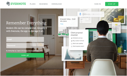
- Netflix
One big fear users have before committing to sign up for something? That it'll be a pain to cancel their subscription if they end up not liking it. Netflix nips that fear in the bud with the "Cancel anytime" copy right above the "Join Free for a Month" CTA. Reassurance alone boosts signups. Also, you'll notice again that the red color of the primary and secondary CTAs here match Netflix's logo colour.
- Prezi
The folks at Prezi are also into the minimalist design look on their website. Other than the green dinosaur and the dark brown coffee, the only other colour accompanying the predominantly black-and-white design is a bright blue -- the same blue from their main logo. That bright blue is strategically placed on the homepage: the main "Give Prezi a try" CTA, and the secondary "Get Started" CTA, both of which take users to the same pricing page.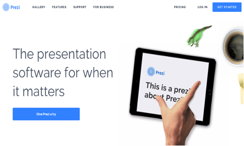
- Ikea
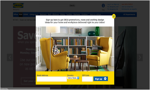
Pop-up CTAs are a more in-your-face way to get visitors to convert. They normally lead to newsletter sign-ups, downloads, or blog subscribe forms like IKEA does here. The retail giant highlights their brand colours while letting you know exactly what you’ll be getting by filling in your information.
- Spotify
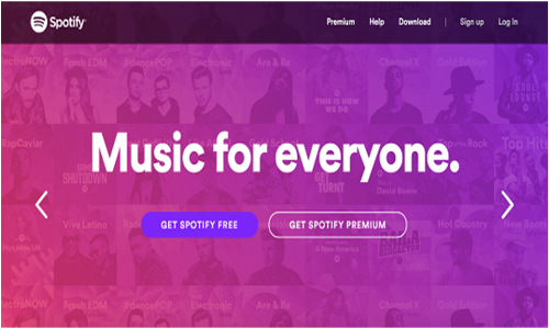
Spotify has taken an interesting approach to their CTA design. They feature two competing CTAs - one leading to Spotify Free and the other to the paid version. Spotify wants to make it clear people can pay for their service (their overall goal), but knows they ultimately get more paying customers after they’ve tried their freemium. That’s why that CTA is more prominently displayed on the page.
Call to action buttons is the closest one can get to actually walking the customer to the (digital) storefront, hence it is essential to optimize the usage of CTA buttons to stay afloat in this digital world.


